Overview
FibAlgo - Oscillator Matrix is a statistical oscillator analysis indicator that identifies dynamic overbought and oversold zones by analyzing where price pivots have historically occurred relative to oscillator values. Instead of relying on fixed thresholds (e.g., RSI 70/30), it calculates data-driven zones based on actual pivot frequency distributions.
The indicator supports six oscillator types (RSI, MFI, Momentum, Stochastic, Stochastic RSI, Chaikin Money Flow), applies optional data decay weighting to favor recent market behavior, and displays an advanced analysis table with confidence scores and performance metrics.
Frequency-Based Dynamic Zones
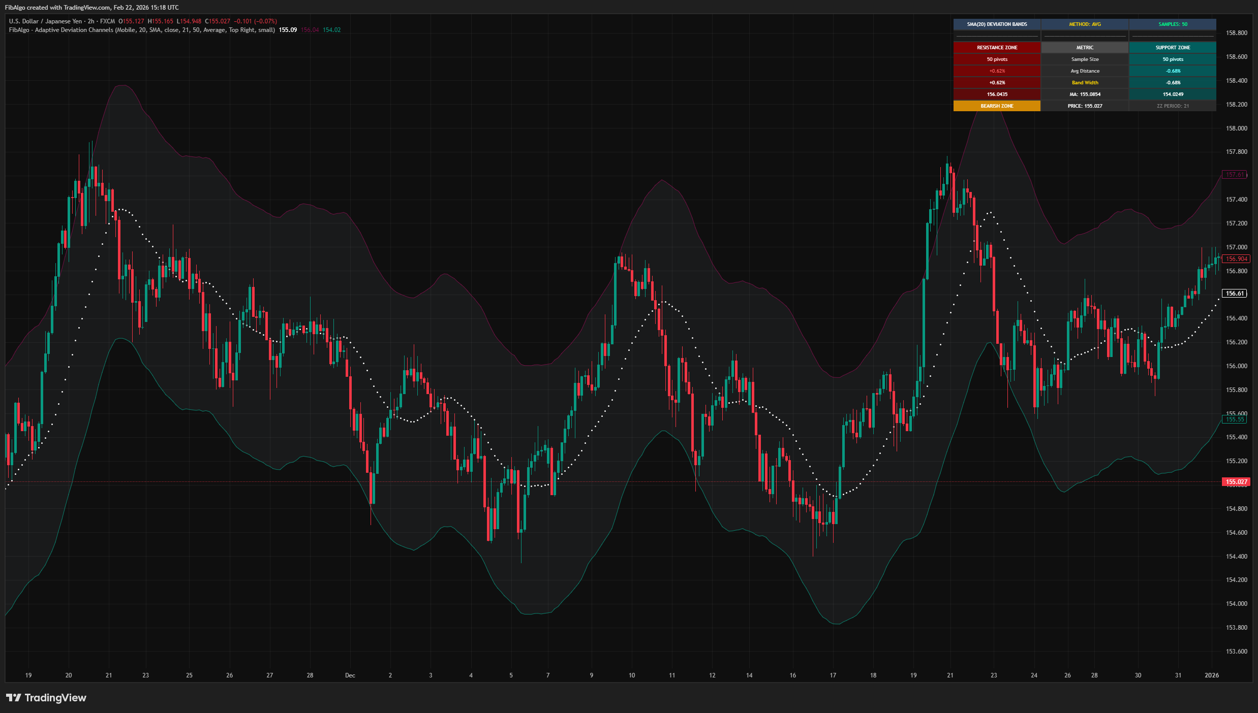
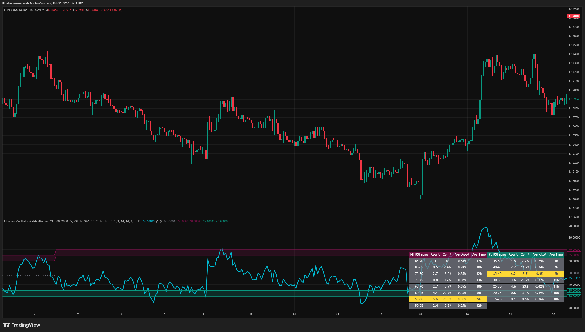
Traditional oscillator analysis uses fixed thresholds — for example, RSI above 70 is considered overbought. This indicator takes a different approach: it examines where price peaks (PH) and price troughs (PL) have actually occurred on the oscillator scale, categorizes these values into 5-point ranges (e.g., "75-80", "80-85"), and identifies which range has the highest weighted frequency. The result is a pair of dynamic bands that shift as the market's behavior evolves.
Data Decay Weighting
When enabled, the system assigns exponentially decreasing weights to older pivots. This means recent pivot behavior influences the zone calculation more heavily than older data. The decay rate (default: 0.95) controls how aggressively recent data is favored. A value closer to 1.0 treats all data nearly equally; lower values emphasize recent pivots more strongly.
Performance Analysis
For each oscillator category where a pivot occurred, the indicator measures what happened next: how far price moved after the pivot (Avg Drop% for peaks, Avg Rise% for troughs) and how many bars it took to reach that extreme (Avg Time). This provides context beyond simple frequency — a zone may be frequent but produce only small follow-through moves, or infrequent but associated with larger price changes.
Step 1 — Pivot Detection
A zigzag algorithm detects price peaks (PH) and price troughs (PL) using a configurable period (default: 21 bars). Each confirmed pivot records the oscillator's value at that bar.
Step 2 — Category Distribution
Oscillator values at pivots are grouped into 5-point categories (0-5, 5-10, ... 95-100). For non-bounded oscillators (Momentum, CMF), values are first normalized to a 0-100 scale. Each category accumulates a weighted count based on how many pivots fell within that range.
Step 3 — Mode Detection
The category with the highest weighted count becomes the "mode" — the most frequent oscillator range for that pivot type. The PH mode defines the upper (maroon) band and the PL mode defines the lower (teal) band. These bands update dynamically as new pivots form.
Step 4 — Performance Measurement
When performance analysis is enabled, the indicator looks forward from each historical pivot (up to a configurable number of bars) and records the maximum price change and timing. These values are averaged per category and displayed in the analysis table.
Step 5 — Visualization
The oscillator value is plotted as the main line. The two dynamic bands are drawn as filled regions. A dynamic mid band (average of upper and lower band centers) provides a neutral reference. An optional analysis table displays the full statistical breakdown.
Six Oscillator Types
- RSI — With optional smoothing (SMA, EMA, RMA, WMA, VWMA) and Bollinger Band overlay.
- MFI — Money Flow Index for volume-weighted momentum.
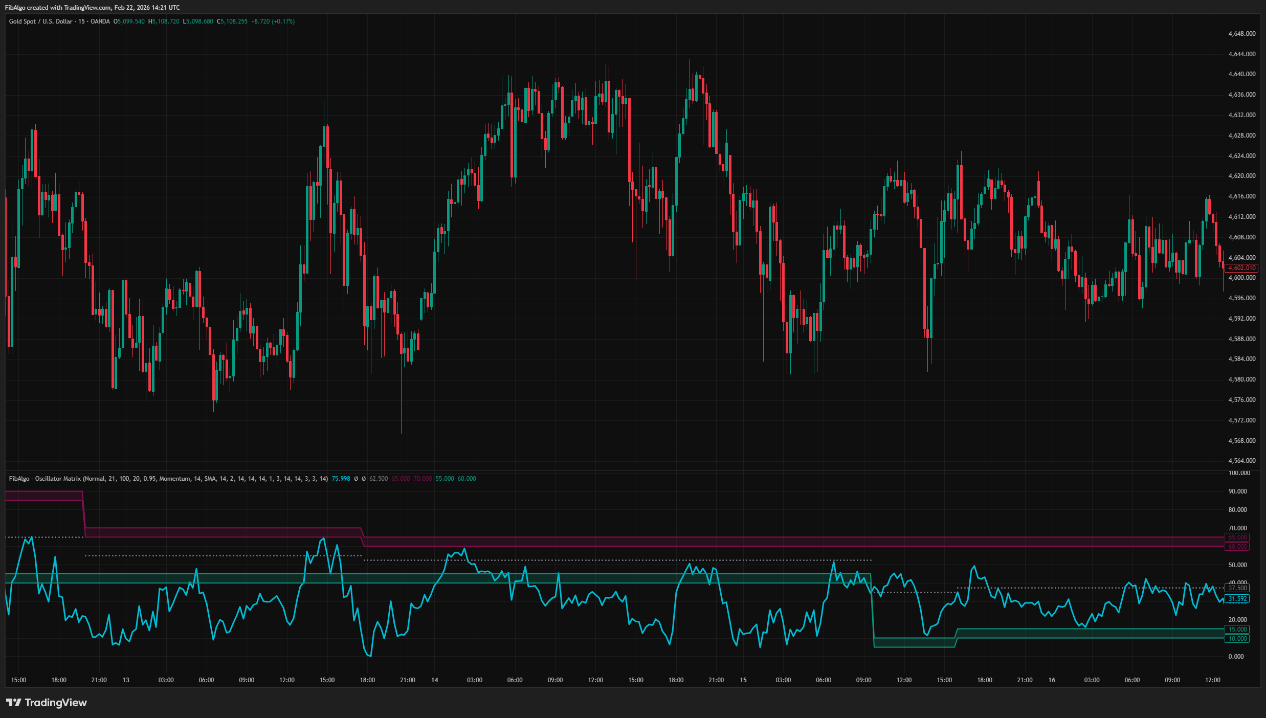
- Momentum — Auto-normalized to 0-100 scale.
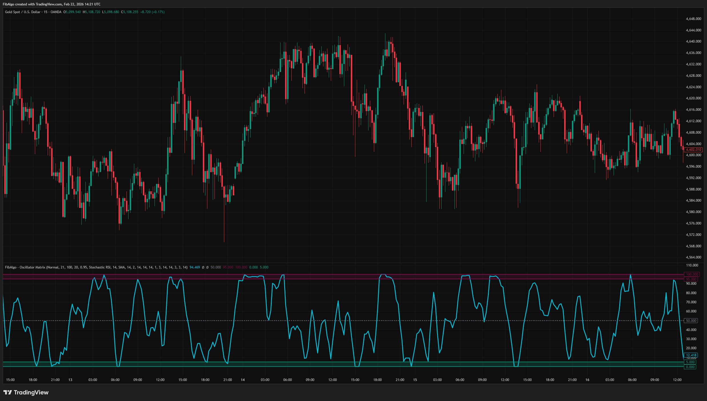
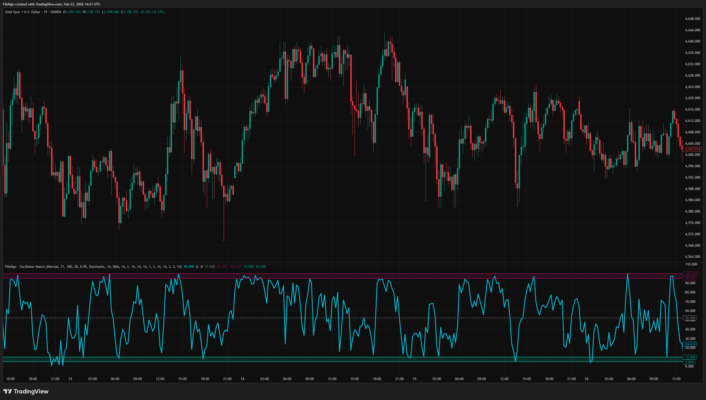
- Stochastic — With configurable %K smoothing and optional %D line.
- Stochastic RSI — With configurable %K smoothing and optional %D line.
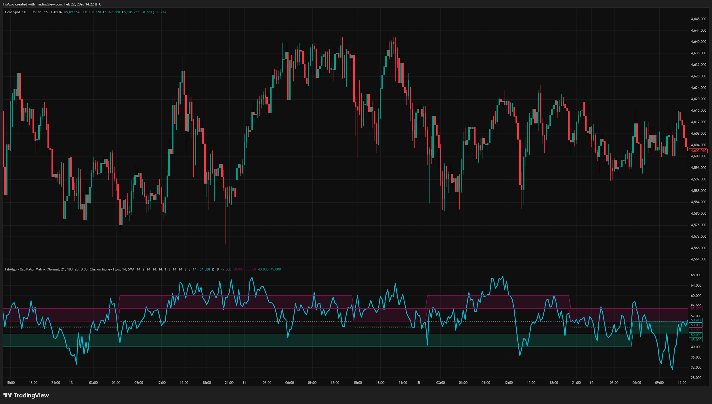
- Chaikin Money Flow — Auto-normalized from -1/+1 to 0-100 scale.
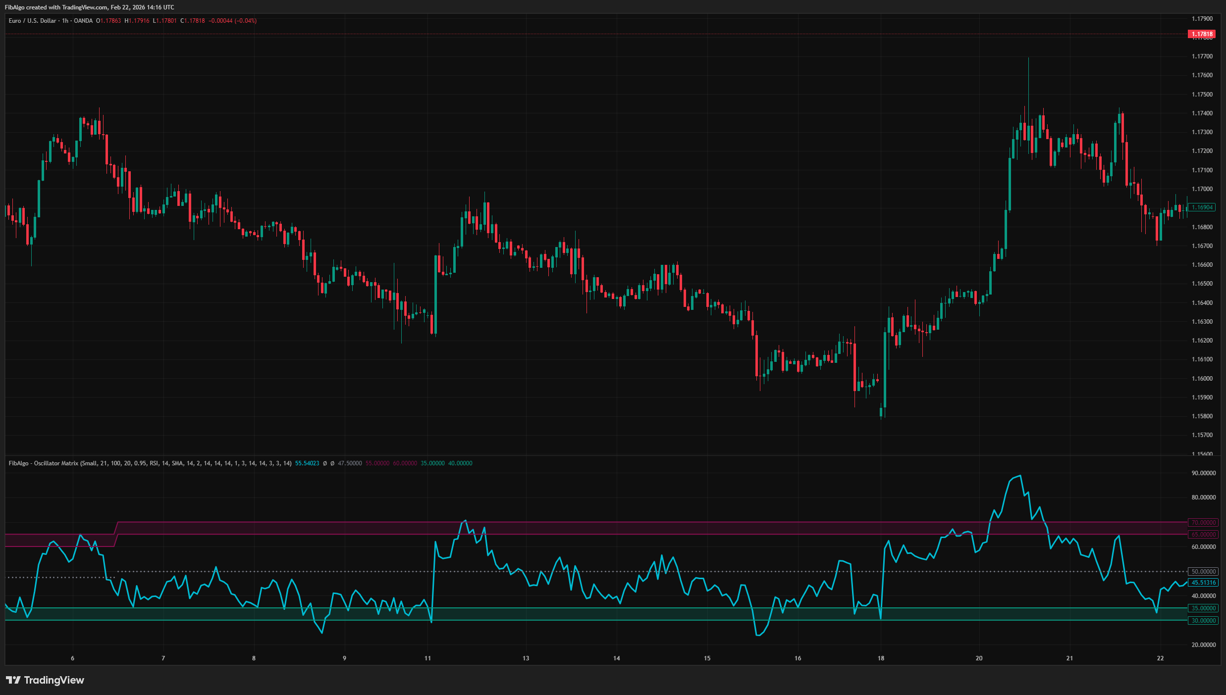
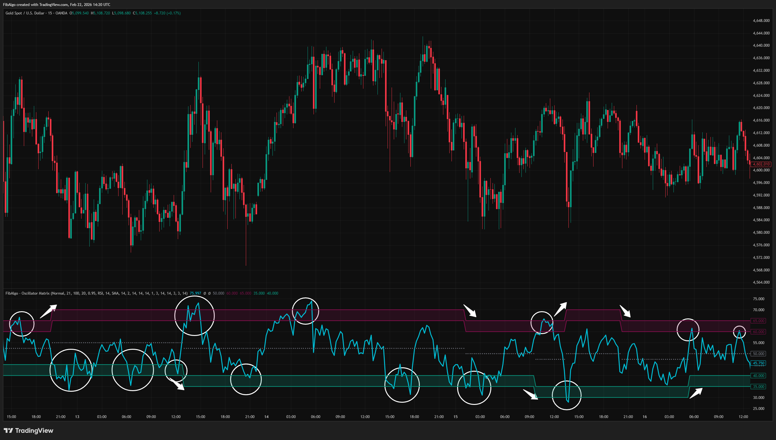
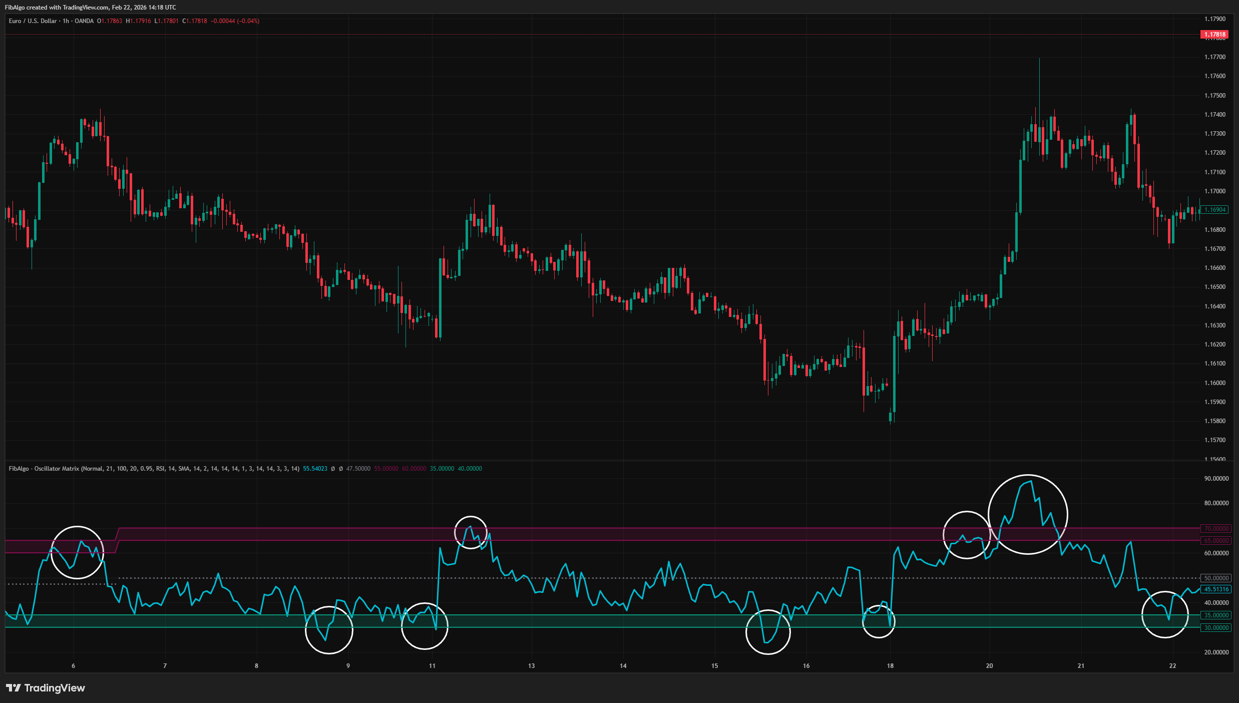
Adaptive Frequency Bands
- Maroon band marks the oscillator range where price peaks occur most frequently.
- Teal band marks the oscillator range where price troughs occur most frequently.
- Bands shift automatically as new pivot data accumulates.
- Optional data decay weights recent pivots more heavily.
Advanced Analysis Table
- Side-by-side PH and PL statistical breakdowns.
- Zone, Count, Confidence%, Average Performance%, and Average Timing columns.
- Highest-frequency zone highlighted in yellow.
- Four table size options (Tiny, Small, Normal, Large).
RSI Smoothing Options
- Six smoothing methods: SMA, SMA + Bollinger Bands, EMA, SMMA (RMA), WMA, VWMA.
- Bollinger Band overlay with configurable standard deviation.
- Smoothing can be enabled or disabled independently.
Alert System
- Peak Zone Entry — triggers when the oscillator enters the maroon band.
- Peak Zone Exit — triggers when the oscillator leaves the maroon band.
- Trough Zone Entry — triggers when the oscillator enters the teal band.
- Trough Zone Exit — triggers when the oscillator leaves the teal band.
- Mid Band Cross Up / Down — triggers on crossovers of the dynamic mid band.
- Band Level Shift — triggers when the mode category changes and bands move to a new level.
- Each alert type can be toggled individually. Messages include ticker, timeframe, oscillator type, and current value.
Getting Started
Add the indicator to any chart. The default settings (RSI, Period: 21, Lookback: 100 pivots, Decay enabled) work well for most liquid instruments on 1H to 4H timeframes.
Reading the Chart
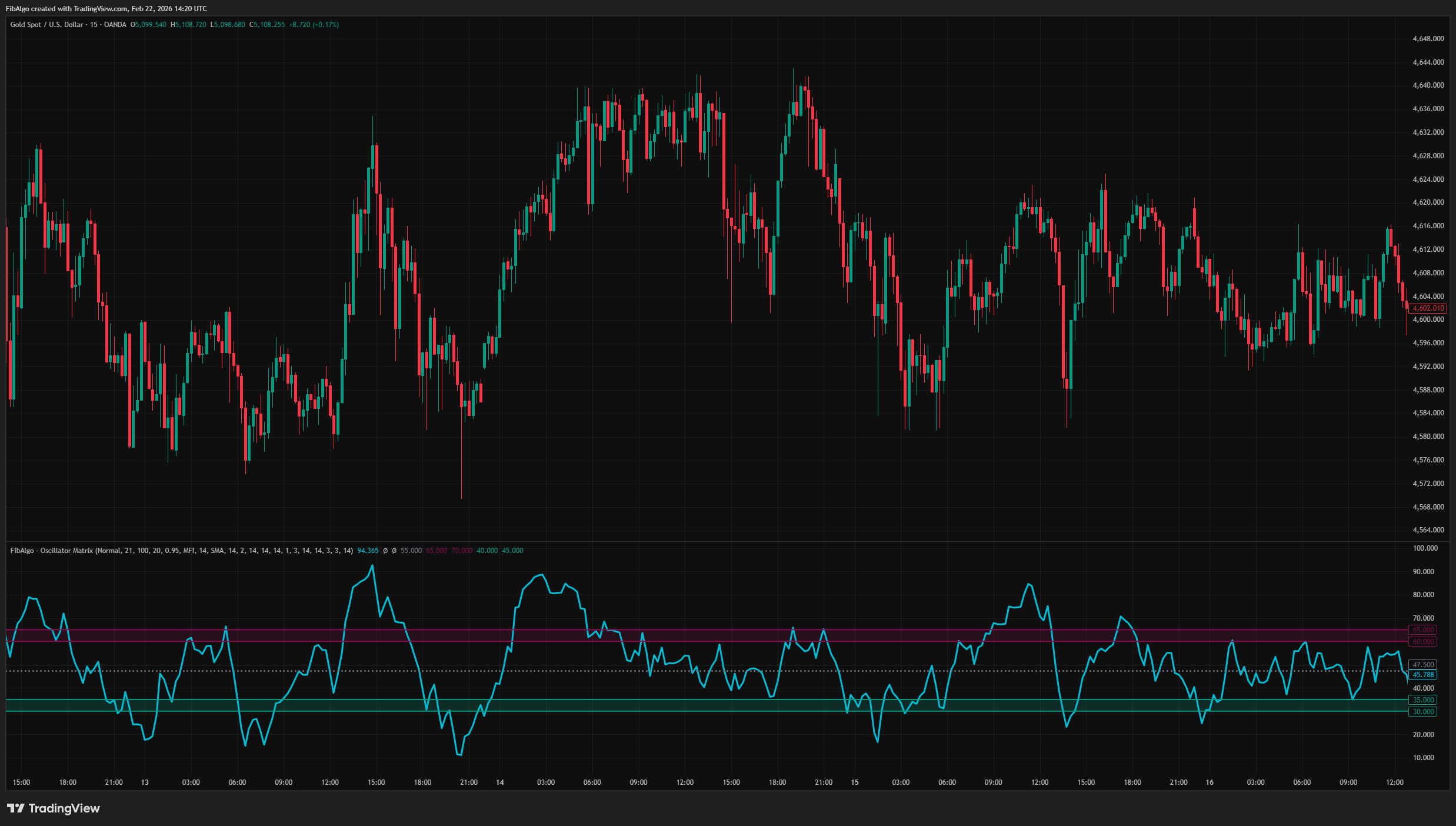
- Aqua line = Current oscillator value.
- Maroon filled region = Peak zone — oscillator range where price peaks have occurred most frequently.
- Teal filled region = Trough zone — oscillator range where price troughs have occurred most frequently.
- Gray dotted circles = Dynamic mid band (average of peak and trough zone centers).
- Yellow row in table = Highest-frequency category for that pivot type.
Key Inputs
- PH/PL Period (2–200): Controls zigzag sensitivity. Higher values detect larger swings.
- Lookback Pivots (10–500): How many historical pivots to include in the analysis.
- Enable Data Decay: When on, recent pivots receive higher weight.
- Decay Rate (0.1–1.0): Controls how aggressively recent data is favored.
- Bars to Check Performance (5–100): How far forward to measure price movement after each pivot.
Suggested Workflow
1. Observe where the oscillator line sits relative to the maroon and teal bands.
2. When the oscillator enters the maroon band, note that price peaks have historically occurred in this range. 3. When the oscillator enters the teal band, note that price troughs have historically occurred in this range. 4. Enable the analysis table to examine confidence percentages and average performance for each zone. 5. Use the performance metrics (Avg Drop%, Avg Rise%, Avg Time) as additional context when evaluating potential setups.- This indicator is a technical analysis tool, not a trading system. It does not generate buy/sell orders.
- Zone frequency is based on historical pivot data. Past oscillator-pivot relationships do not guarantee future behavior.
- The analysis requires a minimum number of pivots to produce meaningful statistics. On newly listed instruments or very low timeframes, results may be unreliable until sufficient data accumulates.
- Data decay weighting can cause zones to shift rapidly during periods of changing market structure, especially with low decay rate values.
- Momentum and CMF normalization uses a 500-bar lookback window. Extreme values outside this window may affect the normalization scale.
- Performance analysis measures maximum price change within a fixed forward window. Actual outcomes depend on the trader's exit criteria and are not captured by this measurement.
The oscillator calculations (RSI, MFI, Stochastic, Stochastic RSI, Chaikin Money Flow) are based on their respective well-established formulas. The frequency-based dynamic zone system, weighted category analysis, performance measurement engine, and the analysis table are original contributions.
Frequently Asked Questions
Unlock exclusive FibAlgo tools
Our best trading indicators plus AI-powered analysis for advanced trading.
Unlock now